Case Studies
UI/UX Design Web development
Enostrada - Wine
and Cullinary Magazine
the challenge
Enostrada is a dream come true for three friends who share a love for travel, exceptional food and of course - wine. Writing culinary / wine articles, travelling to unique places, and blogging were already part of their existing careers. This time, however, they decided to do something together. By combining their talents, knowledge, and experience. Enostrada, the wine road, was born.
Role & Services
UX Design
UI Design
Branding
Art Direction
the project
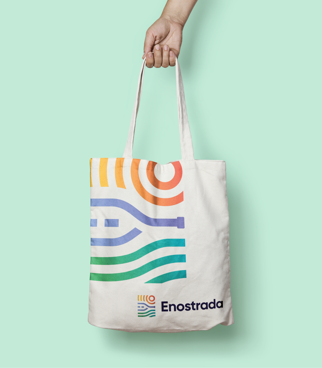
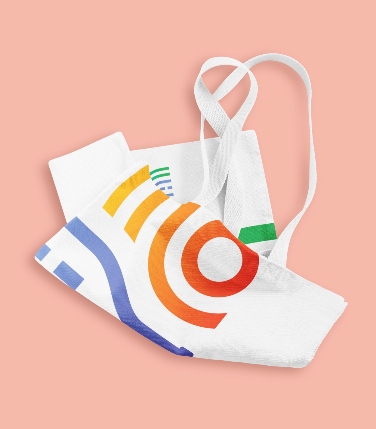
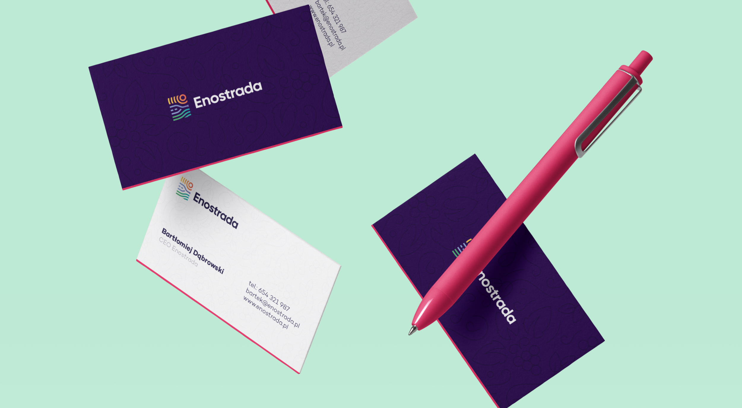
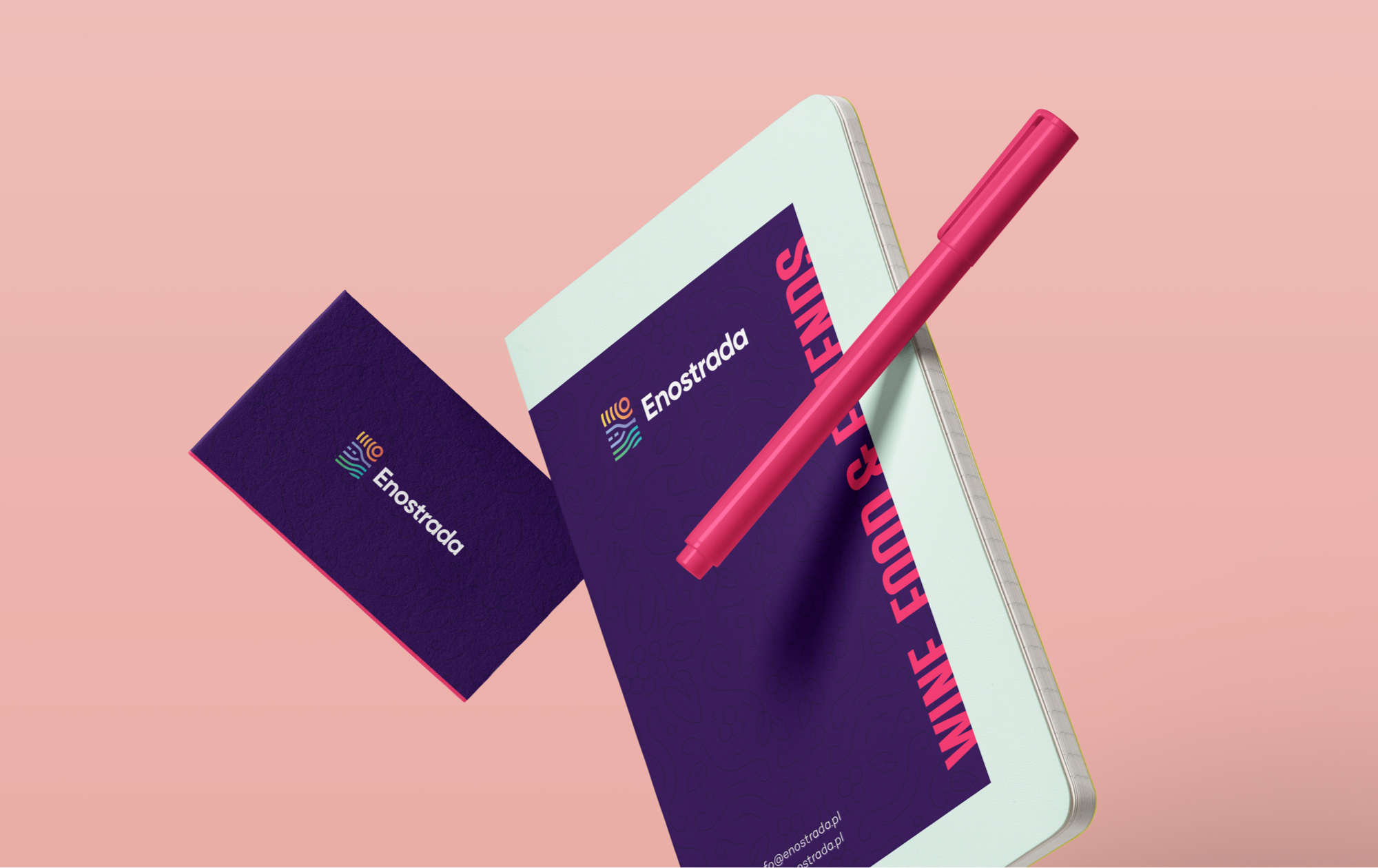
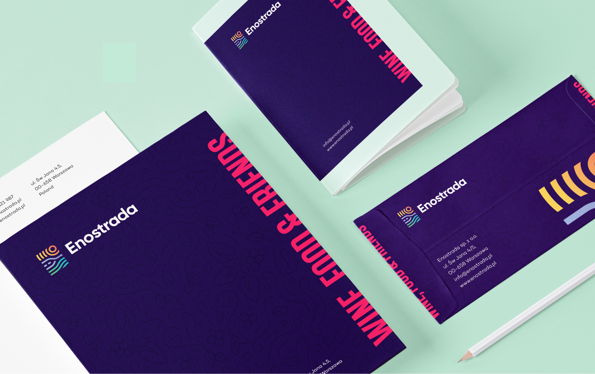
The website is divided into several categories, but wine is the most important one. Every journey, recipe, video, or event is accompanied by wine. With an advanced wine search engine, you can find the right drink for any situation or meal. As a part of the project, we created branding, printed materials (business cards, bags, notebooks, letterheads), and an online magazine. Let's start at the beginning: branding.
Beginning of the road
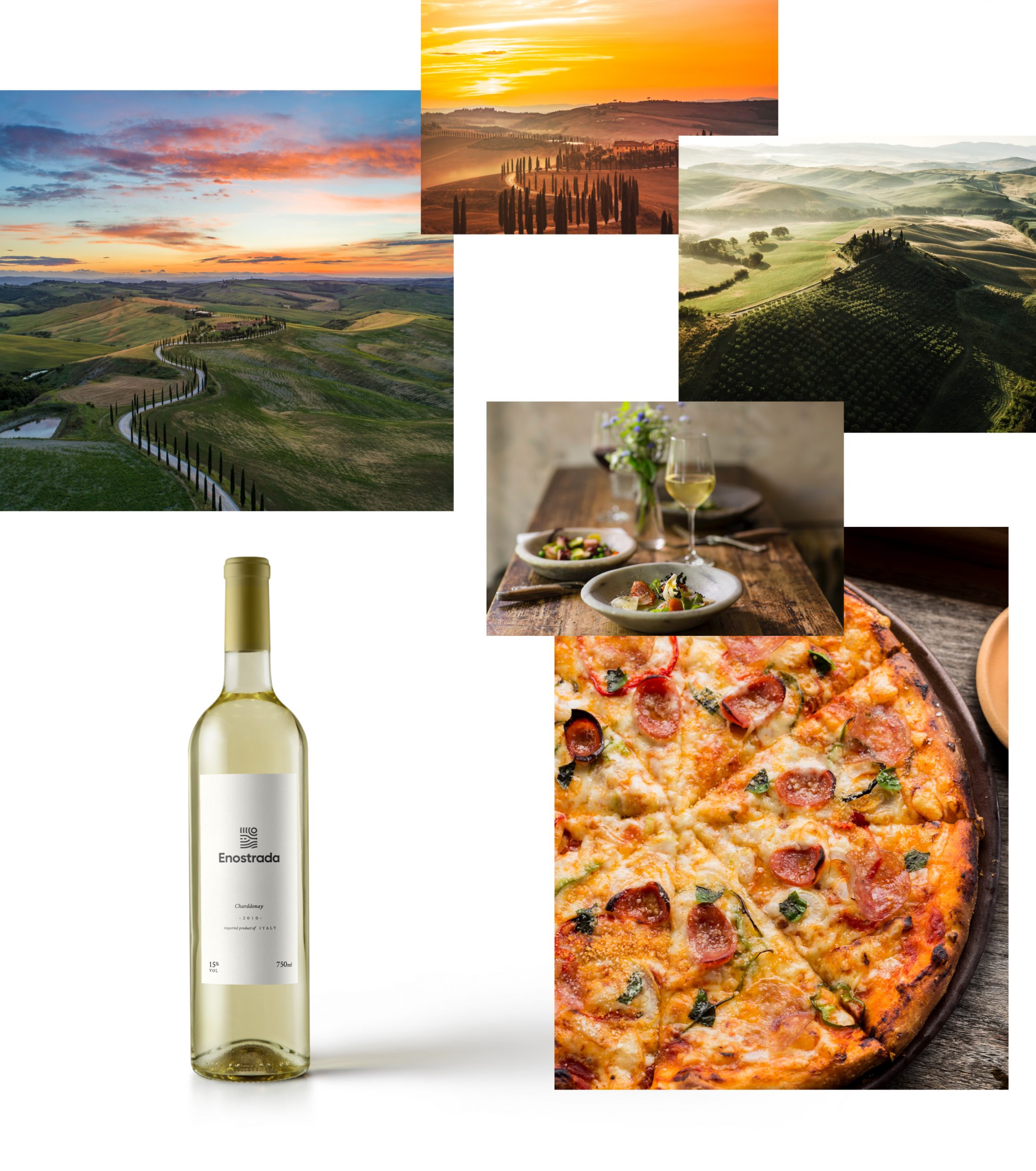
We started work on the project by defining all the key elements of the brand that will set it apart from the competition. It was important for us to include the characteristic road sign referring not only to the name of the road, but also to the authors' favorite place in the world - Toscana. As an illustration, the sign depicts the sunny hills of Toscani, green grapevines, and a bottle of wine that turns into a road. The road will supply Enostrada.
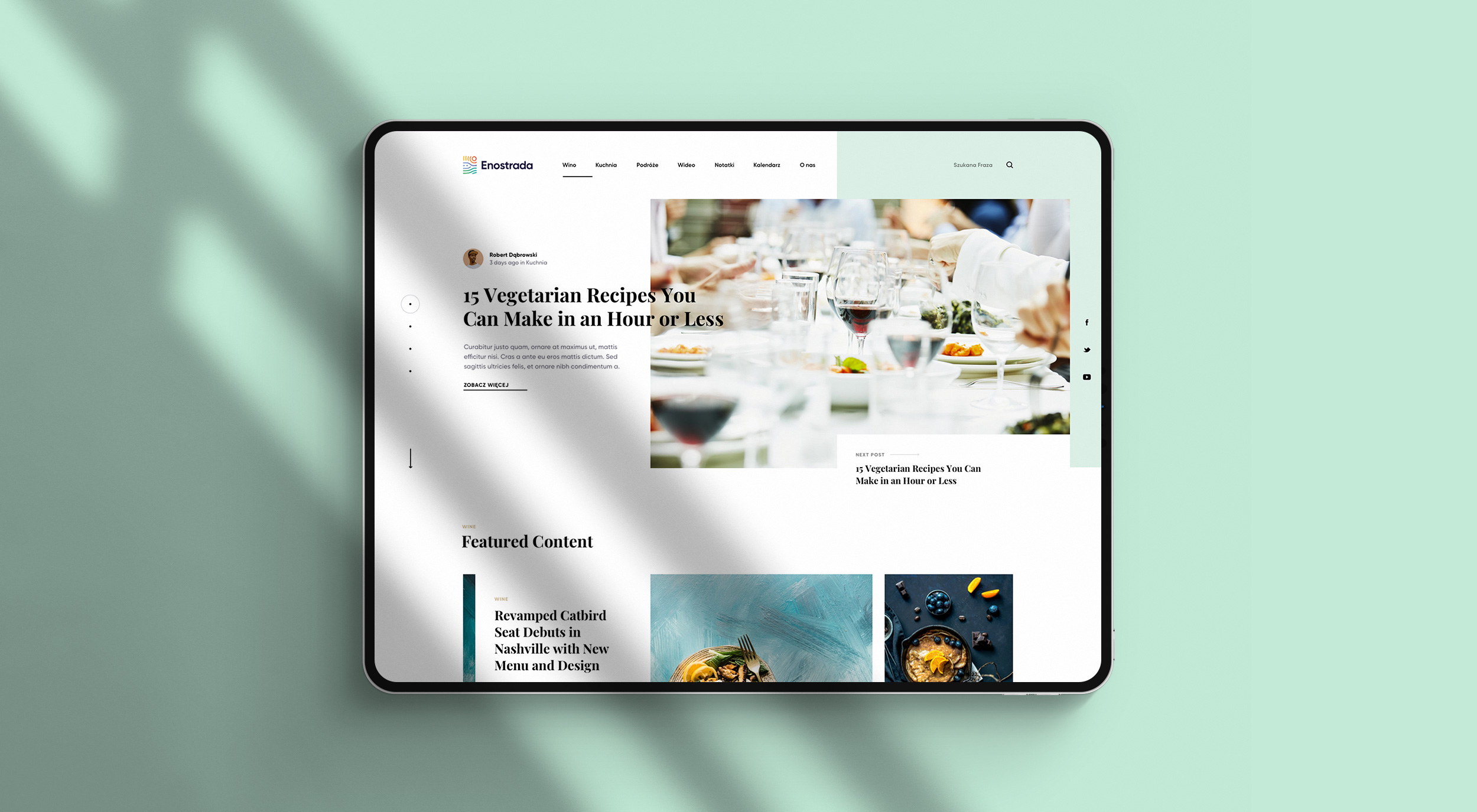
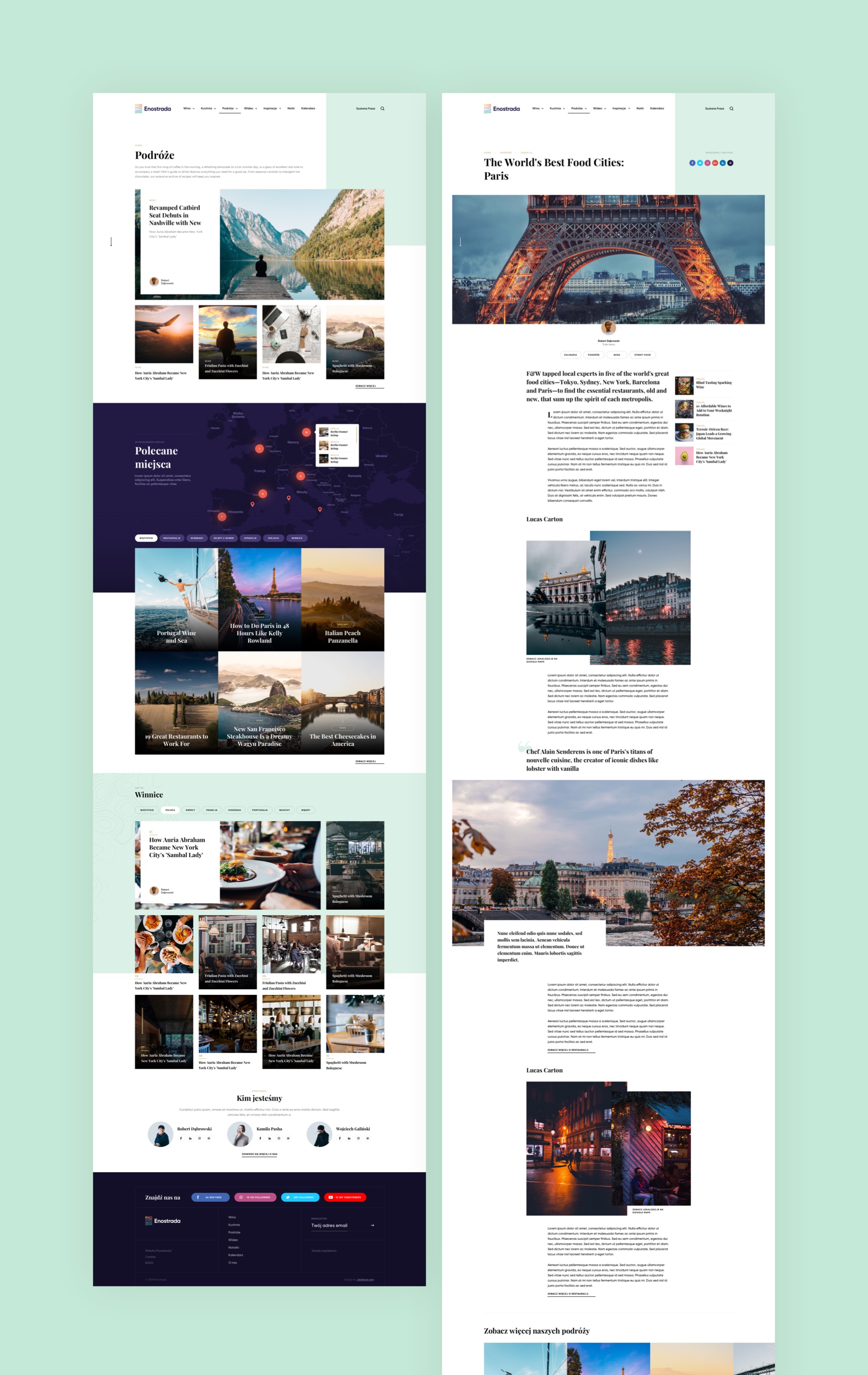
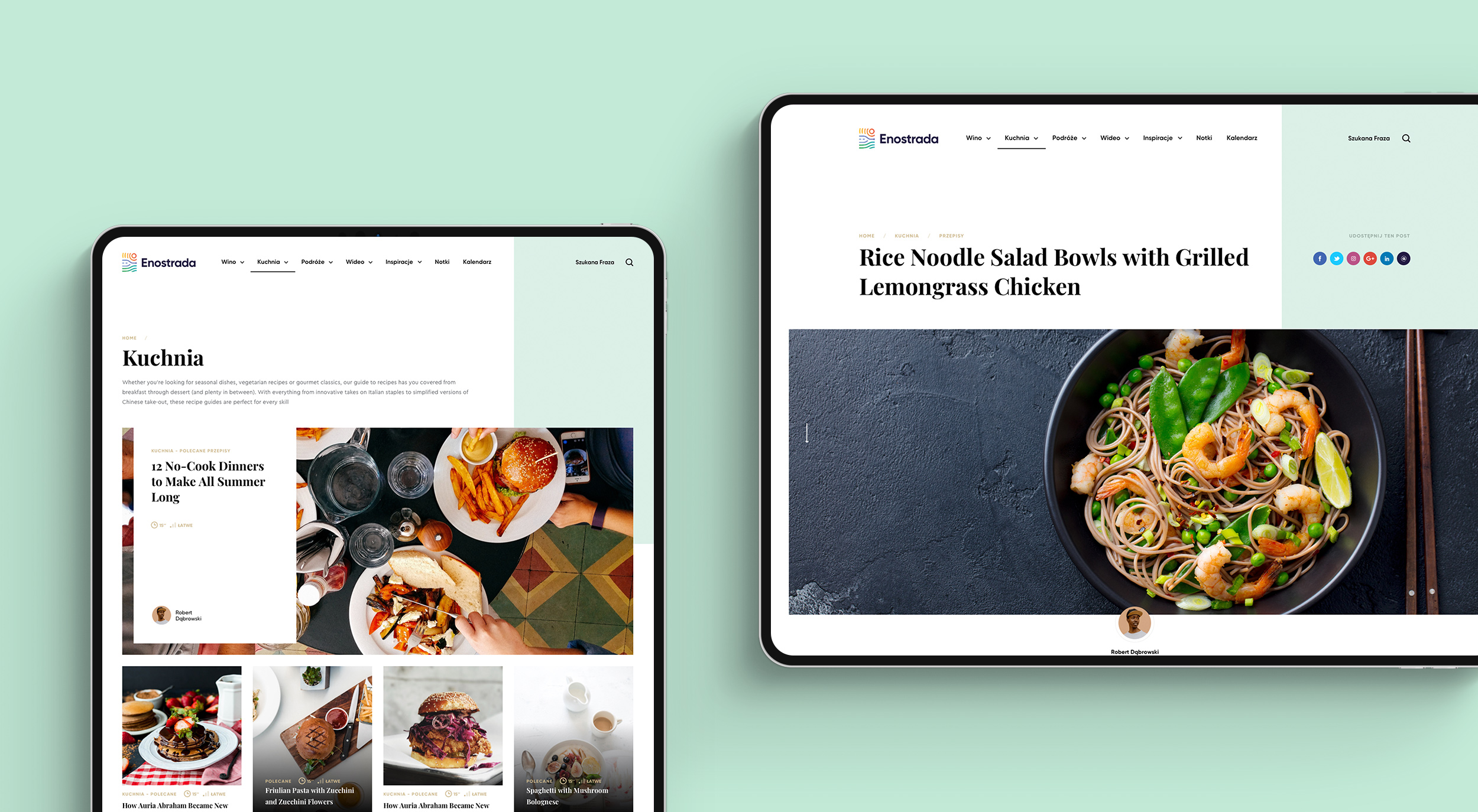
Rather than an ordinary blog, the home page is designed to resemble a culinary magazine. An asymmetrical photo of the last article dominates the upper part. Asymmetrical elements give the design style and uniqueness. To make the nooks and crannies of the website more accessible, the articles have been organized into sections. In order not to repeat the schematic appearance in the home page sections, the elements change their appearance while maintaining their function. The full-screen sections are interspersed with tiles with links to articles.
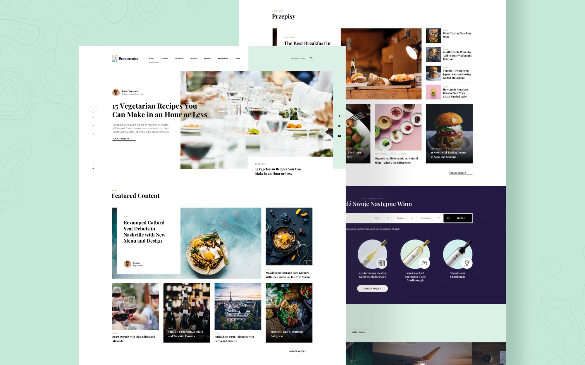

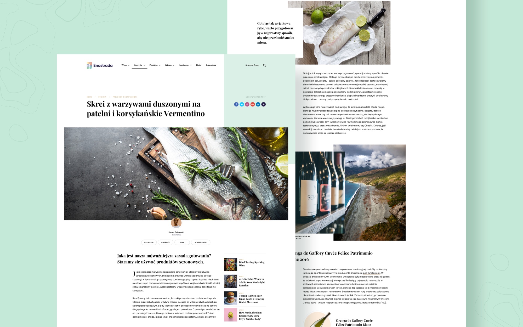
Asymmetry creates a division that repeats on the page. Later, this division is used to play with elements. We designed the article's subpage so that it is easy to read. The content is arranged in narrow columns interspersed with larger titles and photo galleries. As a result, the content is easy to access, legible, and boredom-free.
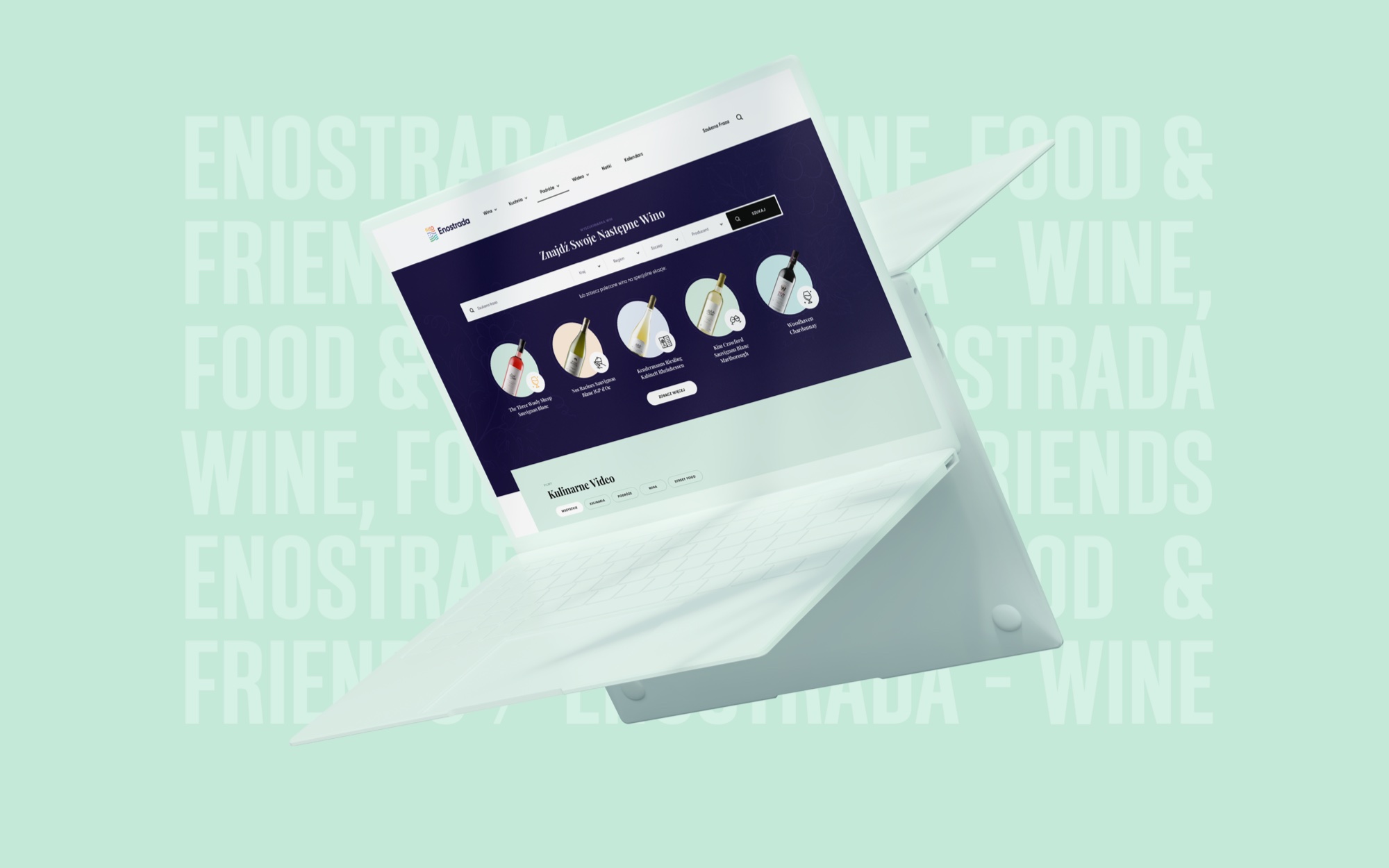
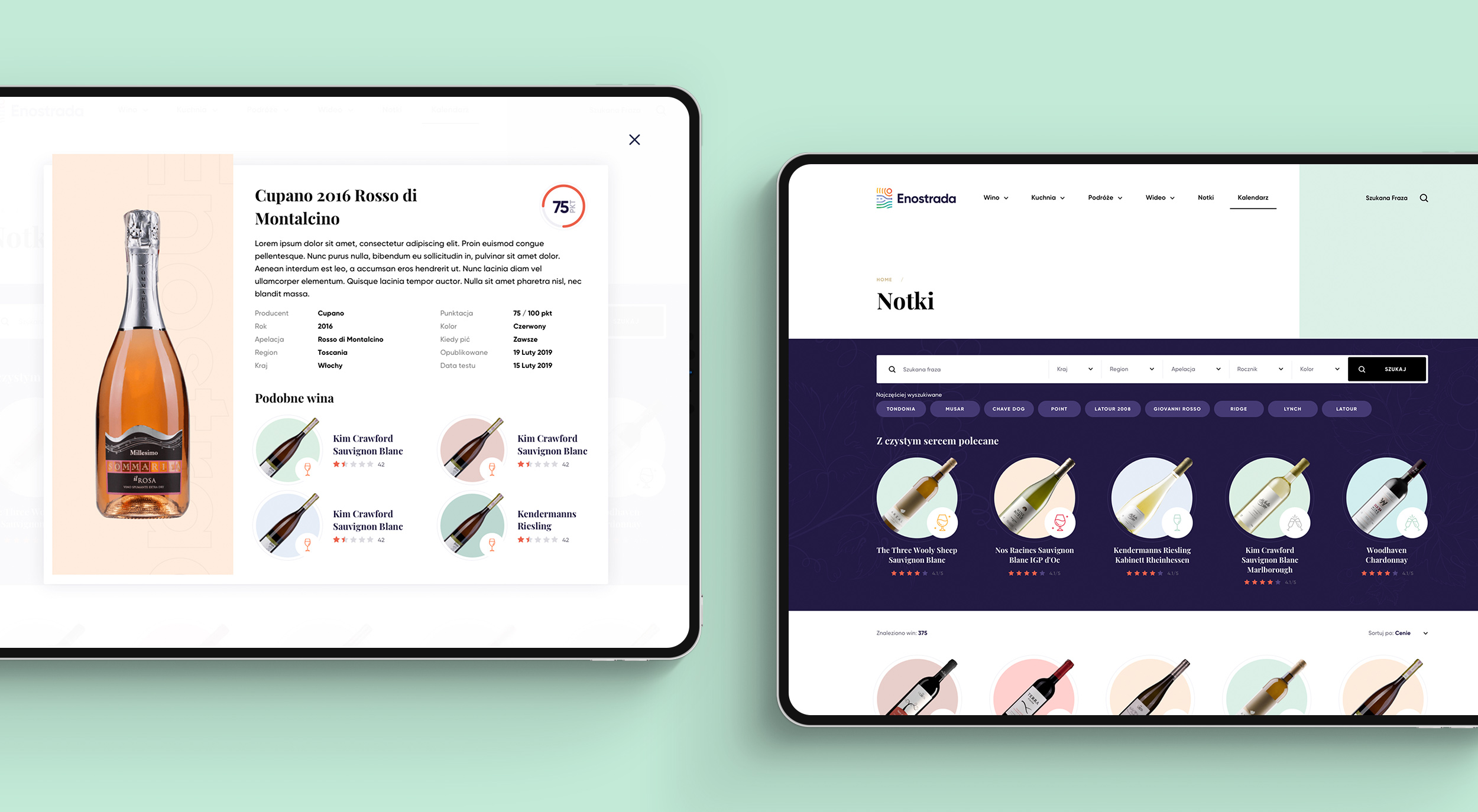
The wine search engine Notes was an important feature for clients. The search engine allows you to search for wines by country, region, year, or color. Additionally, the editorial office selects the most searched and recommended wines. To avoid boring the viewer, we chose pastel colors for the bottle background and designed icons that clearly indicate the "purpose" of the wine.
CLIENT TESTIMONIALS
First of all we would like to point out that Matt’s trade-mark is, hard to beat, professionalism. His qualifications, creativity, imagination, experience and excellent communication during the whole project make him extremely sought for specialist. From the beginning our cooperation was smooth and of outstanding quality on every stage of the project. Everything was on schedule and exceeded our expectations. Working with Matt was a real pleasure and we will turn to him again when starting new venture.

Bartłomiej Dąbrowski
Co-Founder in Enostrada.pl
Let’s make
Let’s make
Let’s make
Let’s make
Let’s make
something great!
something great!
something great!
something great!
something great!
Got a project in mind? Stay in touch