Case Studies
UI/UX Design, Branding, art direction
Reimagining financial software
for entrepreneurs
the challenge
We were asked by a Dutch financial services company to redesign their prominent software and improve their UX. The previous version of the software wasn't very user-friendly. An extensive amount of data was presented in a tabular format. Users were unable to sort columns, change views, or were just overwhelmed by the outdated design. To show all the data in a more interesting, clean way, we used more visual graphics including charts, summarizing data in small boxes, and designing new branding and key visuals to give the application a more forward-looking direction.
Role & Services
May 2020
UX Design
UI Design
Art Direction
Branding
Print Design
the project
Our first step in rebranding was to design a simple but outstanding logo that can also be used as an application icon, as well as setting up branding guidelines. Our second step was to redesign the entire dashboard app to make it more useful and appealing to clients.

branding / key visual
We wanted the new branding for Riskprotector to be simple, but also memorable. We chose to make the letter R by using two overlapping elements. By using modern shapes and appropriate colors, we get a more professional impression of the company. Our main graphic / style is a colorful pattern with pictures of young entrepreneurs as our key visual.


the project
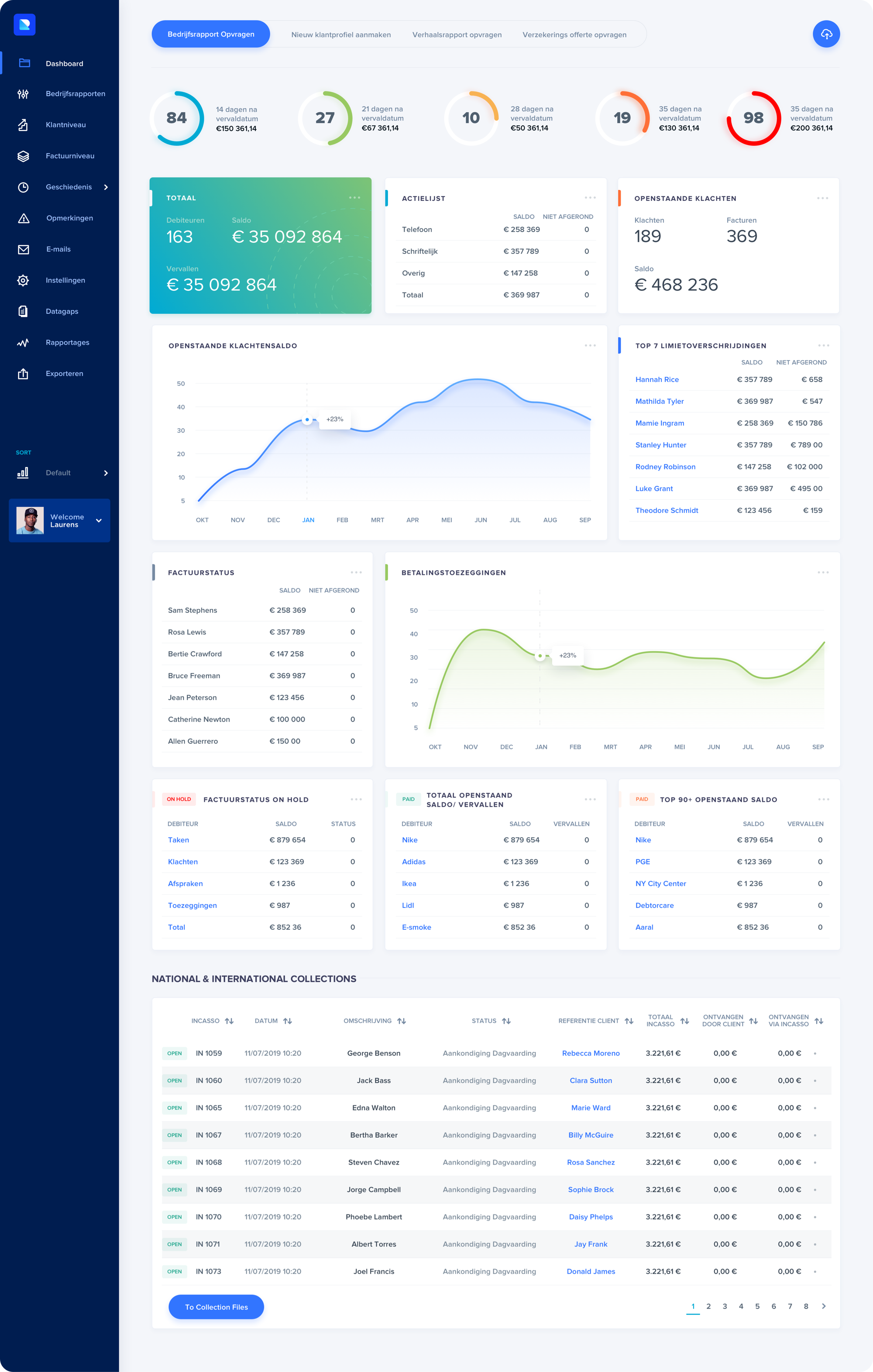
Riskprotector dashboard is the hub for all information gathered together in one place and presented in modules. Modules have been designed so that they can easily be used on subsequent subpages. The whole dashboard has been designed to be as readable for the user as possible.


the project
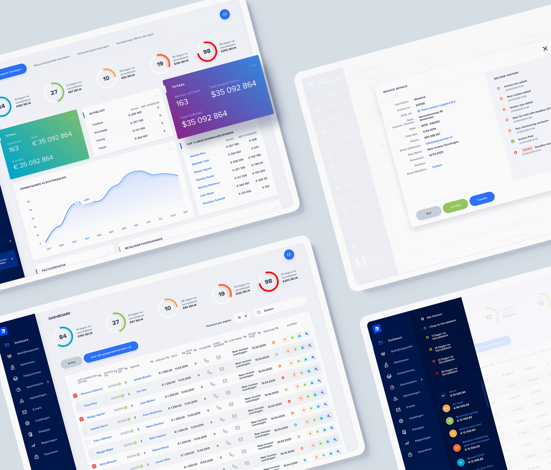
There were key visual elements not only in banner ads, but also in dashboard pages and graphical elements. One of the more notable elements was the registration / login subpage.

dashboard subpages
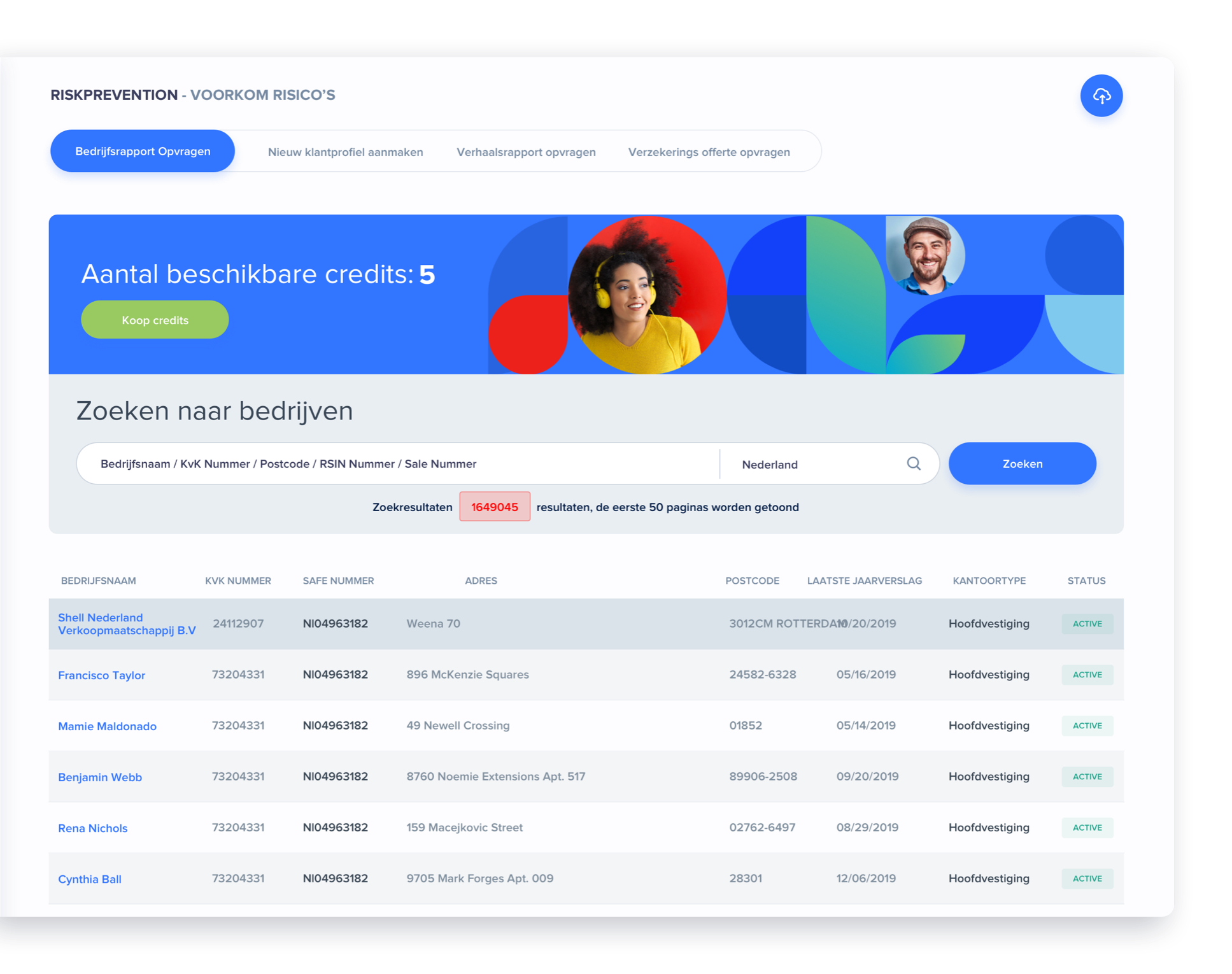
Graphic elements and accessories make tabular subpages more appealing. In this case, they were used with a banner informing about the number of searches left. By doing so, the buy credits section is more visible.
dashboard subpages
A large amount of data had to be presented in a small space, so icons and graphics were used to hide the action. All of it has been designed to be as legible as possible for the user.


CLIENT TESTIMONIALS
I started to work with Mateusz for the redesign of our website. He did a great job with that. After we finished the website we work together now on several projects. I'm very happy with the speed of his working process and with the quality of the designs and would recommend his services to anyone.

Laurens Lemmens
New Business Manager at Invorderingsbedrijf B.V.
Let’s make
Let’s make
Let’s make
Let’s make
Let’s make
something great!
something great!
something great!
something great!
something great!
Got a project in mind? Stay in touch
